¿Un cafecito?
Brand Design, PoS, Production Design, Photography and Video, Brand Strategy
CLIENT: PATAGONIA BLEND
It was 2016 and Patagonia Blend was doing fine. But fine wasn't enough – they needed a complete overhaul of their branding in order to lead the way in the soon-to-be competitive market of speciality coffee roasters.
I approached Patagonia Blend in 2015 with the goal of elevating their branding so that it would match the world-class product they offered. It quickly became very clear that the potential was enormous as we started drawing inspiration from the region's wild and untamed land and rich history, but always keeping an eye on the global market to monitor and -if possible- get ahead of consumer and design trends.
Patagonia is a territory where mixtures are common: the Atlantic Ocean meets the Pacific through Magellan's Strait and several waves of Chilean and European settlers arrived in the late 19th century that gave way to a diverse, multi-cultural city at the edge of the world.
Through a series of workshops, we decided that the brand needed to maintain -and showcase- Patagonian culture in a straightforward but approachable fashion.
Visually, it needed to be remarkable, recognisable and desireable.

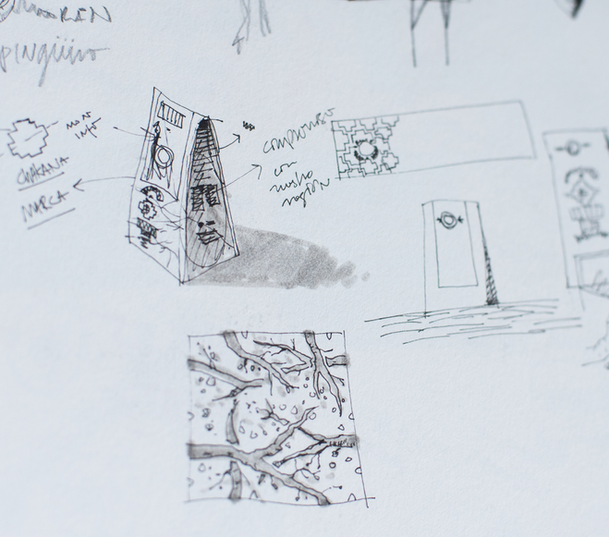
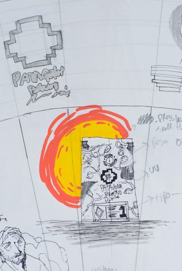
The logo is comprised of two elements locked together: the "chakana" and a PB monogram.
The former can be seen throughout the city in indigenous textiles and the latter is scattered across the neo-classical buildings that populate the city centre. It felt like the most symbolic way to showcase the blend of cultures through old and new but also classic and modern.
The typeface is a versatyle family that hints at traditional sign-making in a modern way, allowing for classic visual elements or novel assets under the same brand family.
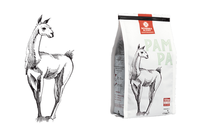
The guanaco and puma illustrations, made by Chilean painter Daniela Kovacic Muzio, were comissioned to be the centerpiece of the packaging, making it easily recognisable and emomtionally rooted to the local fauna.
A key part of the design process was realising that the packaging had to be "orally transmitable": easy to describe, easy to point out, easy to buy. "I'll have the blue one". "Can I have the one with the guanaco, please?"

The project transformed the brand, helping it become one of the most recognisable and loved speciality coffee brands in the region. The yearly sales prior to the rebrand were USD $50.000. As of today, their sales have increased 13X, totalling USD $650K.
COVID CONTENT
While in lockdown, I helped the brand's awareness and recognition by creating bespoke video and photography content.
BRAND EVOLUTION
It's been almost a decade, and the brand has expanded significantly thanks to their stellar in-house designer/creative director Marianne Klock.
All new product lines posses the same ethos and guidelines set in place when the project started. While some elements have been refined, branding system has proven to be adaptable, resilient and timeless.

CREDITS
Designer/Illustrator
In-house Designer
DANIELA KOVACIC
MARIANNE KLOCK


