

House of Papito
A DESIGN-LED CANNABIS ACCESORIES BRAND ROOTED IN CULTURE AND CREATIVITY
Brand Design, Art Direction, Production Design, Lifestyle and Product Photography, Supply Chain Advisor... and pretty much everything in between.
CLIENT: PAPITO
Papito is a self-initiated cannabis and lifestyle accessories brand that blends premium design, cultural commentary, and the creative spirit of cannabis consumption. Born out of a linguistic pun and a design experiment, Papito has grown into a distinctive micro-brand with premium products, clever branding, and an engaged community. From high-end precision grinders to football kits, I’ve led every aspect of the brand: naming, design, sourcing, photography, and creative direction.
The brand name is a triple-layered pun: Papito (“daddy”) riffs off the Chilean slang “pa’ pito” — meaning “for a joint.” This linguistic play was the seed for a brand that’s both cheeky and clever, designed to resonate with cannabis consumers who value quality, creativity, and a deeper cultural connection.
I wanted to challenge the cliché “stoner” aesthetic by crafting high-end cannabis tools and wearables with the same rigour as luxury brands. My guiding question: What would a Hermès grinder look like?
Business-wise, this absence of visually appealing objects also meant that there was an opportunity to be seized. As cannabis becomes regulated, design enters the scene to act as a differentiation and added-value tool: you don't shop for what's cheap, you shop for benefits, percentages, and ultimately, vibes.
So while this isn't the case in many countries -yet- I wanted to build a brand for when it inevitably happens.
Let me tell you how I made just that.
THE CHALLENGE
Back in 2018, I noticed a glaring absence in the cannabis accessories space: everything felt either low-quality, or locked into tired “stoner” clichés (sorry, Bob Marley fans). Cannabis consumption was rapidly changing and so were its users and their tastes.
I wanted to create something different — design-forward, culturally rooted, and quietly bold. A statement piece that you wouldn't hide, but show off. Papito grew into a brand with an aesthetic and a voice of its own, unapologetically tied to Chilean and Patagonian slang but open to everyone who wants to join.
More importantly, I wanted to create an ongoing experiment in putting myself in situations my clients would also find themselves in: sourcing, naming, stacking old and new designs and finding new ways to sell their excellent products. This leap means that, beyond design and branding, I can unerstand and connect with my clients becase I know their struggles first hand.
Ultimately, Papito helps me grow as a designer by experiencing what my clients go through, allowing me to experiment, fail and learn what it takes to develop a brand (and a product) and bringing it to market.
BRAND DEVELOPMENT AND IDENTITY
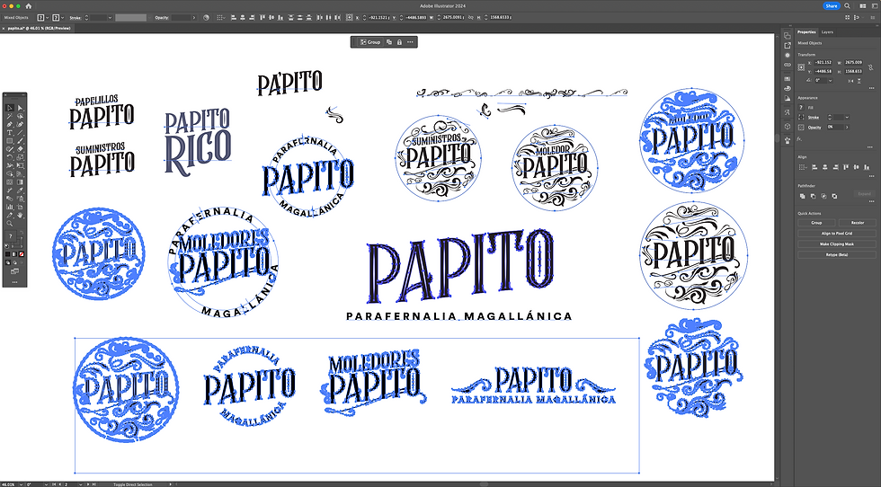
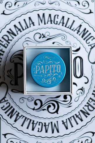
Papito’s visual identity avoids the typical green-and-rasta cues, instead pulling from traditional barber shops, vintage signage, and contemporary fashion references. The logomark had to be functional — easily engraved in my first products— distinct and elegant, working across grinders, papers, mailing bags, and more.
A second, cleaner version of the logo was developed to work as the mail overall logo as several visual iterations of the brand started to emerge as designs for new grinder models.
Over the years, the brand has expanded its visual language, creating limited-edition wrap papers, sleek unboxing experiences, and most recently, a streetwear-inspired sub-label: Papito FC.

PRODUCT DEVELOPMENT
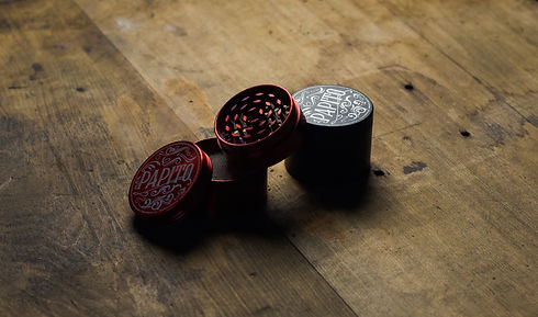
I sourced grinders directly through Alibaba, running material tests and prototype samples.
My first ever sample, a zinc alloy grinder (above), gave me the first product test in pricing, branding and material. I then upgraded my entire product line to a 4-part stainless steel build with magnetic lids and engraved or UV print branding, designed for quality and long-term use.
As the brand grew and I gained a better understanding of the market and manufacturing process, cigar cases and smell-proof glass jars were added to the main product line.


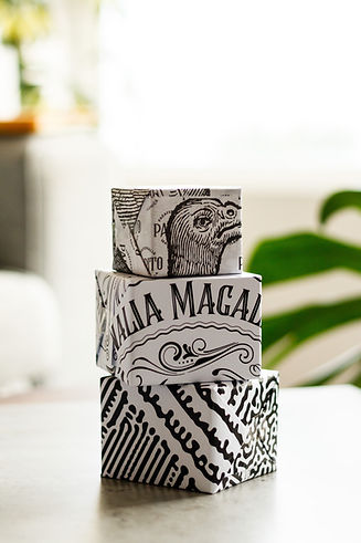
PACKAGING
Wrapping paper is treated as a collection on its own around here. Each 50-issue run features a unique design that is meant to take you on a journey: dazzle camo from the 1930s, "melting" words, abstract 3d art and Voyager's illustrations bring an additional storytelling element to the brand, allowing me to dive deeper into a particular aspect of the concept, momentarily.

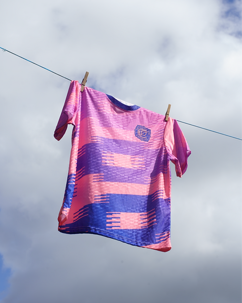
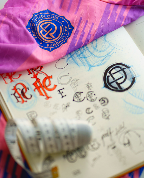
HAT TRICK: PAPITO FC
In 2025, I launched Papito FC, a fictional football club and limited-edition merch line. Inspired by 90s South American kits and “guardapampa” patterns from Patagonia, the kit represents a different side of cannabis culture: energetic, sporty, and proudly weird.
It also tested how far the brand could stretch — from homeware to fashion — while staying recognisably “Papito”. This move also helps the brand connect with an audience that doesn't necessarily smoke or consume edibles and allows them to access the brand promise and culture without compromising their own habits.
But why football shirts? Well...
1. Because Papito's customer base are active. They attend the gym, go hiking, practice some sort of sport at an amateur level and love design. By designing a product they could wear to a wellness-related activity, the brand would gain exposure and wouldn’t have to compete with other brands, as brands like Nike and Adidas aren’t direct competitors to Papito.
2. Because it creates a sense of community. By reframing the brand as a club, the strong sense of identity that comes from using local phrases and idioms, makes the user feel like the brand speaks the same language.
3. Because it plays with the unexpected. The easy route would be to make some hoodies or baseball caps and call it a day. Papito, however, is about delivering desirable products in an unexpected way. Pre-match tops are extremely expressive pieces of branding, where established brands like FC Barcelona, Manchester United or even national representations use it as brand explorations.
Go Papitos!


CREATIVE DIRECTION & CONTENT
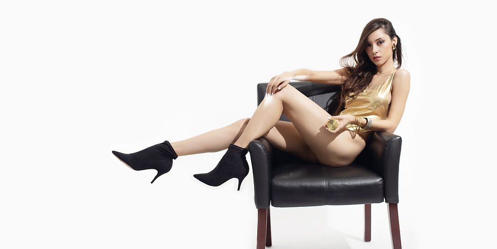
I’ve directed and shot all of Papito’s imagery — from static product shots to reels and editorial-style drops. Every release is treated like a moment: sometimes cryptic, sometimes cheeky, always visually sharp.
Whether on Etsy, Instagram, or in packaging, the brand speaks with consistency and character.


NUMBERS & RESULTS
• 180+ orders on Etsy with 99% 5-star reviews and over 300 total lifetime orders.
• 1 (one) single return to date!
• Loyal customer base built organically through storytelling and packaging
• Successful launch of limited-run apparel
REFLECTION & TAKEAWAYS
Papito taught me to build a brand from scratch, without funding, without a roadmap, and without compromising on craft.
I learned to navigate global sourcing, design for manufacturing, and sustain a tone of voice that balances humour, design, and culture. While I’ve received help from friends as models, testers, and collaborators, the core of the work has been solo — by choice and by challenge.
Papito remains a sandbox for ideas. The next step is scaling without losing soul and open this sandbox to other artists.
CREDITS
Creative Director
Special Thanks
MIRKO VUKASOVIC MORRISON
ANI MILOSEVIC
FELIPE ZERAN
MARIANNE KLOCK
TOBY WILLIAMS
JESS EVERSON
STEPHEN PEEBLES
MY MUM AND DAD WHO DON'T REALLY GET WHAT THESE GRINDERS ARE FOR AT ALL
